Surprising Things You Probably Didn’t Know About the Las Vegas Sign
Originally published at Vital Vegas
![]()
You know the sign. You probably have it on a T-shirt or key chain. And it may very well be your tramp stamp. You know who you are.
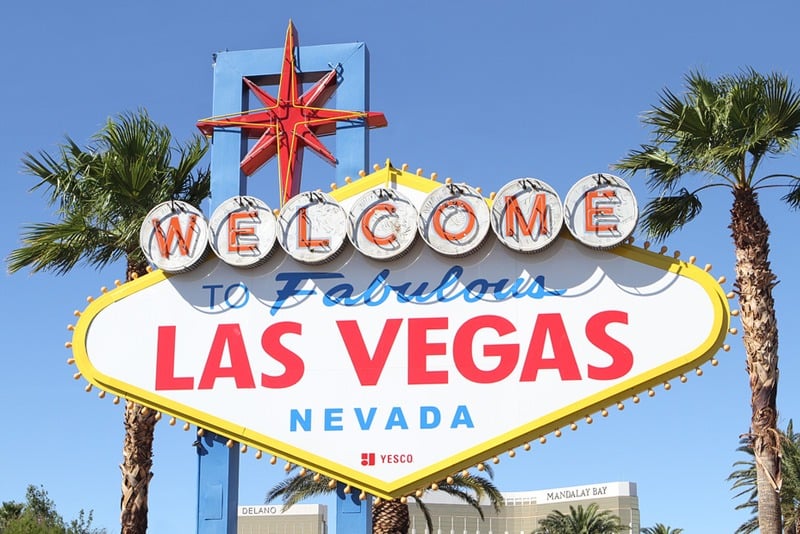
It’s the world-famous “Welcome to Fabulous Las Vegas” sign.
There’s a lot you probably do know about the sign.
Like the fact, there are two of them roadside in Las Vegas, one near Mandalay Bay on The Strip, and another on Boulder Highway. There were three official signs, but one was smashed by a bonehead. Long story.
You can actually see Las Vegas signs everywhere in Las Vegas now, as one of the gift shop chains has life-size versions of the sign at its stores. They’re actually awesome, and convenient for photo ops if you don’t want to trek to the official welcome sign.
Anyway, you also probably know the Las Vegas sign was designed by a woman named Betty Willis. The sign was commissioned by a local salesman, Ted Rogich when Willis worked at Western Neon.
The sign originally cost $4,000.
You may also have heard Betty Willis never copyrighted the sign, so it’s free for all to use, her “gift to Las Vegas.”
You no doubt also know the welcome to Las Vegas sign isn’t within the Las Vegas city limits.
Here’s where we get to the things you may not know.
The distinctive shape of the sign wasn’t original. Willis took inspiration for the diamond shape from the logo used by Goodyear at the time. It was also a popular shape for hotel key tags (also known as “fobs,” used to prevent people from losing keys).
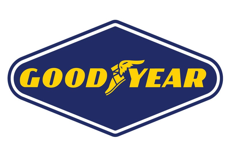 Goodyear logo, meh. Vegas sign, sexy.
The Las Vegas sign also featured a “Disney star,” used frequently in signs designed in the 1950s.
The Las Vegas sign uses the Googie architecture style, the most Las Vegas of all architectural styles, popular in the 1940s and 1950s, which was all about the Space Age, Atomic Age, car culture and futurism. But you probably know all this.
The word “Welcome” in the Las Vegas sign sits inside silver dollars. This, too, wasn’t a particularly original design element, as Riviera’s sign at the time put the letters spelling out Riviera inside discs, casino chips.
As mentioned, Willis was adamant the sign not be copyrighted, but we’ve always been curious if it could’ve been copyrighted given its elements were borrowed from existing, often copyrighted, designs.
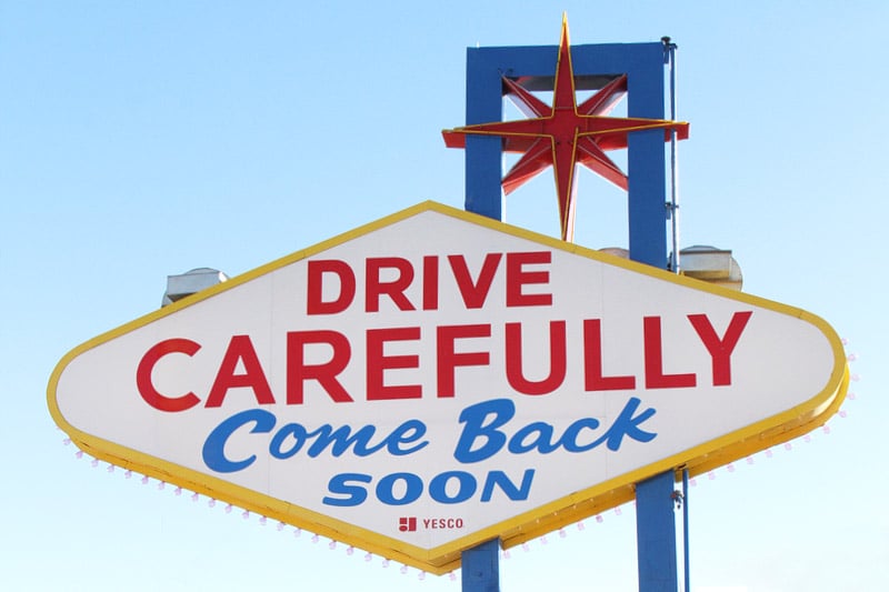 The backside of the welcome sign doesn’t get enough love. In Vegas, never neglect the backside.
While Willis may have drawn inspiration from popular design elements, the way she brought them together has become an undeniable Las Vegas icon and is unlikely to ever be surpassed as a symbol for Sin City.
Here’s Betty. She passed away in 2015.
There’s a great story about the Las Vegas sign on the Neon Museum Web site, so check it out.
Western Neon was eventually acquired by YESCO, the company that owns and maintains the welcome sign. YESCO leases the sign to Clark County (wherein the sign sits).
Here’s something else you may not have known about the Las Vegas sign. When it started appearing on Nevada license plates, Betty Willis got a vanity plate with this on it: MYSGN.
As if creating the Las Vegas sign weren’t immorality enough, Betty Willis also designed the lettering for Moulin Rouge’s sign, as well as the sign for the Blue Angel motel, among many others.
You can see the Moulin Rouge at the Neon Museum, along with lots of other classic signs. It’s a Vegas must-do, like seeing the Bellagio fountains, playing Wheel of Fortune and getting a lap dance.
